Projects
Disc Replacement

Description
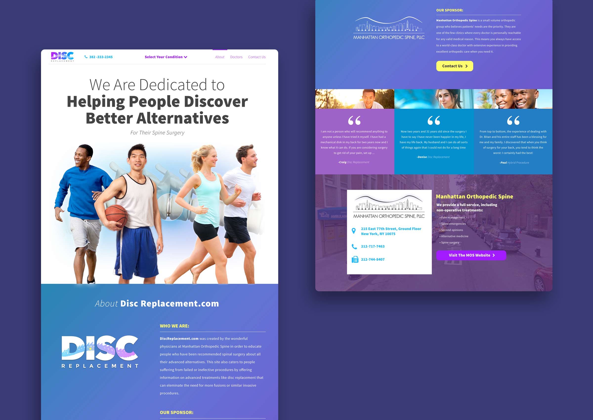
This logo, brand identity, and responsive website are for a spine surgeon in New York City. He wanted to expand his business online, and I designed an eye-catching site to drive users to his practice while giving them valuable information.
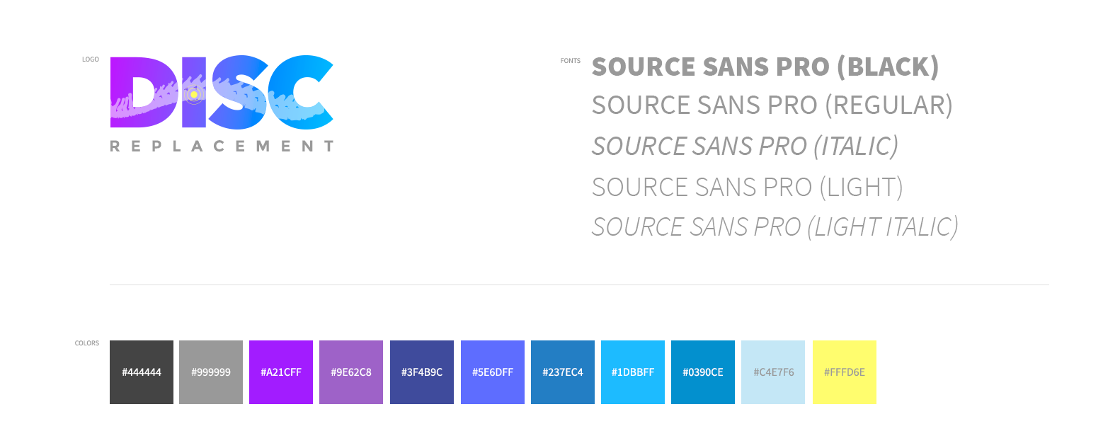
Brand Identity
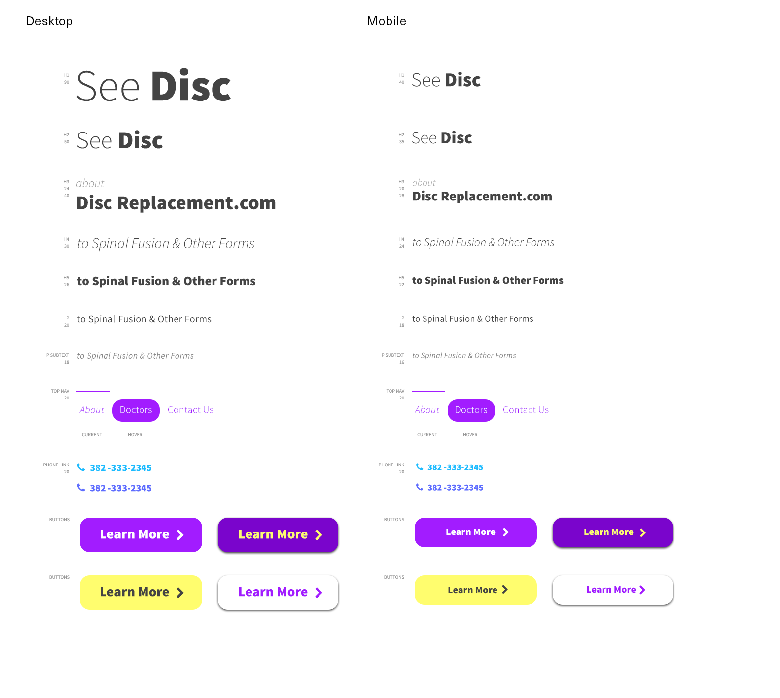
Most medical brands feature some variation of blue. For the Disc Replacement brand, I expanded this to include a wider range of blues, purples, and yellow for calls to action. The logo contains a vector silhouette of a vertebra with a yellow target indicating an intervertebral disc.
Logo
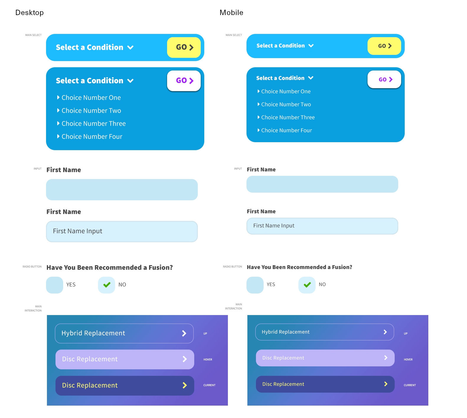
Brand System
Layouts
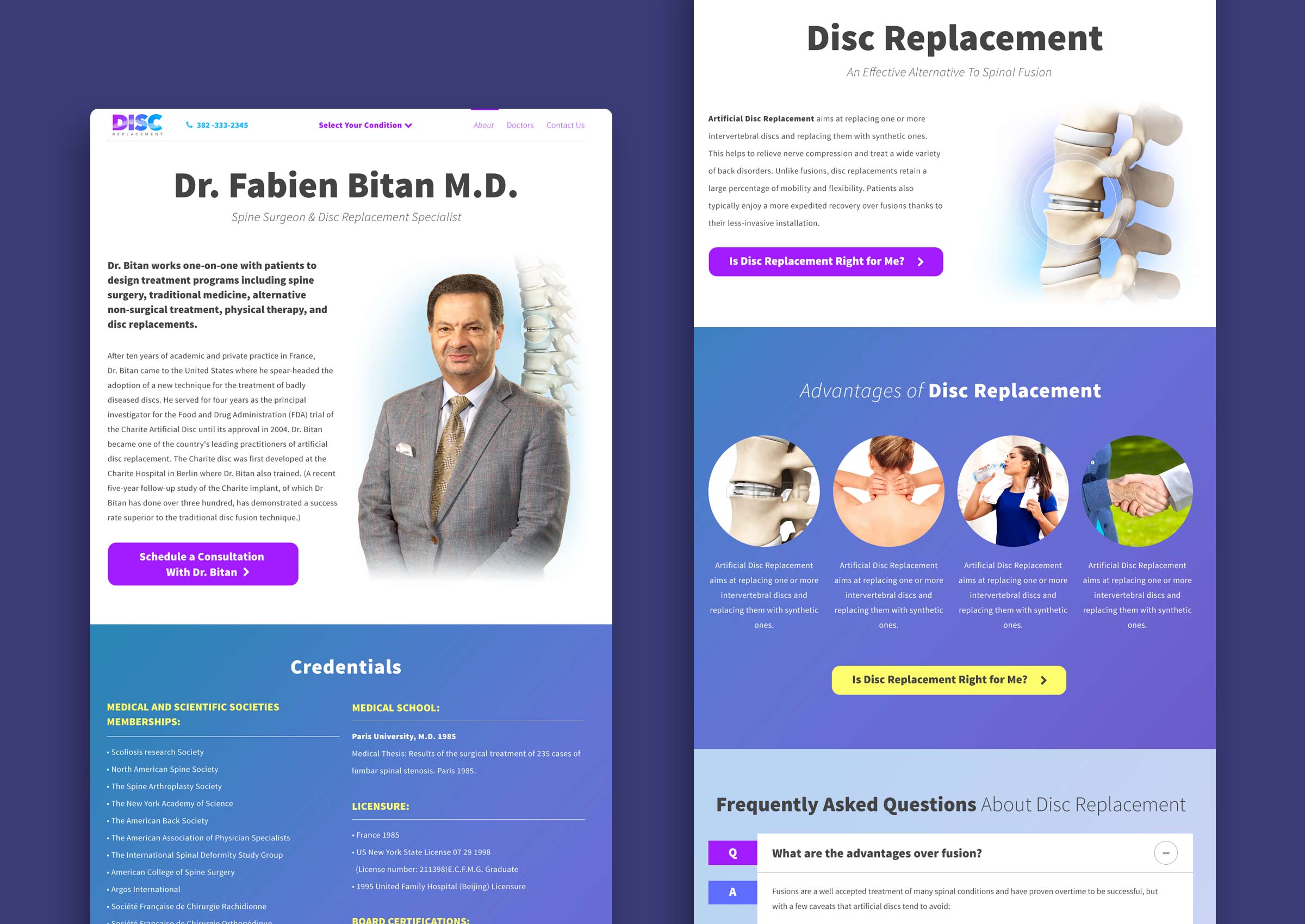
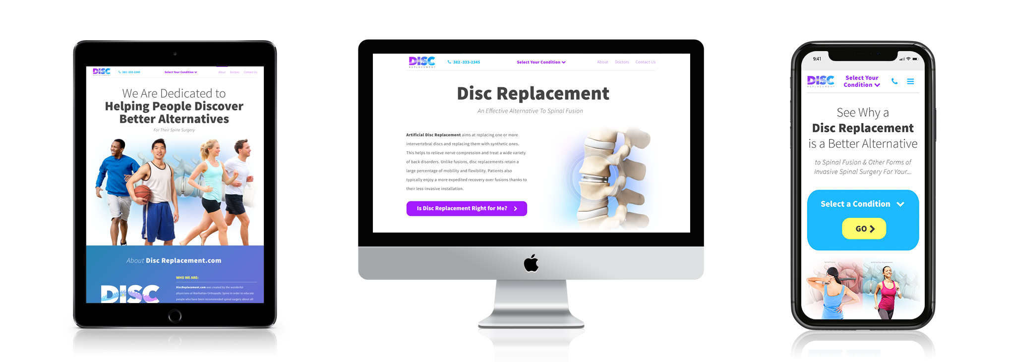
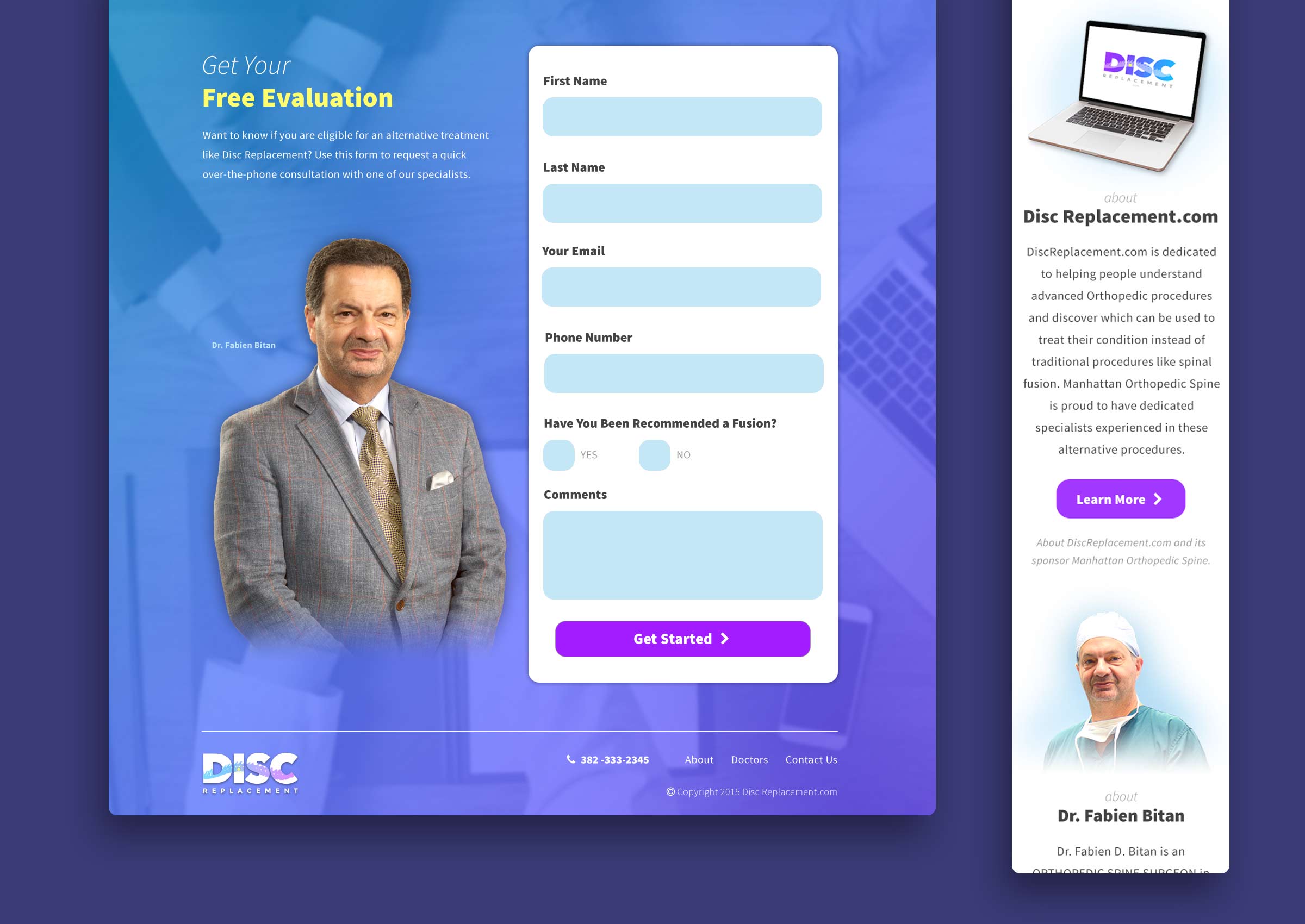
The page layouts are bright and clear, with inviting colors. Extra large H1s effectively deliver intent, and imagery of healthy, active people convey positivity and wellness. The homepage features a call to action above the fold, which invites users to sign up to be contacted by a staff member. As with all sites I design, this one works well on any sized screen.
Homepage

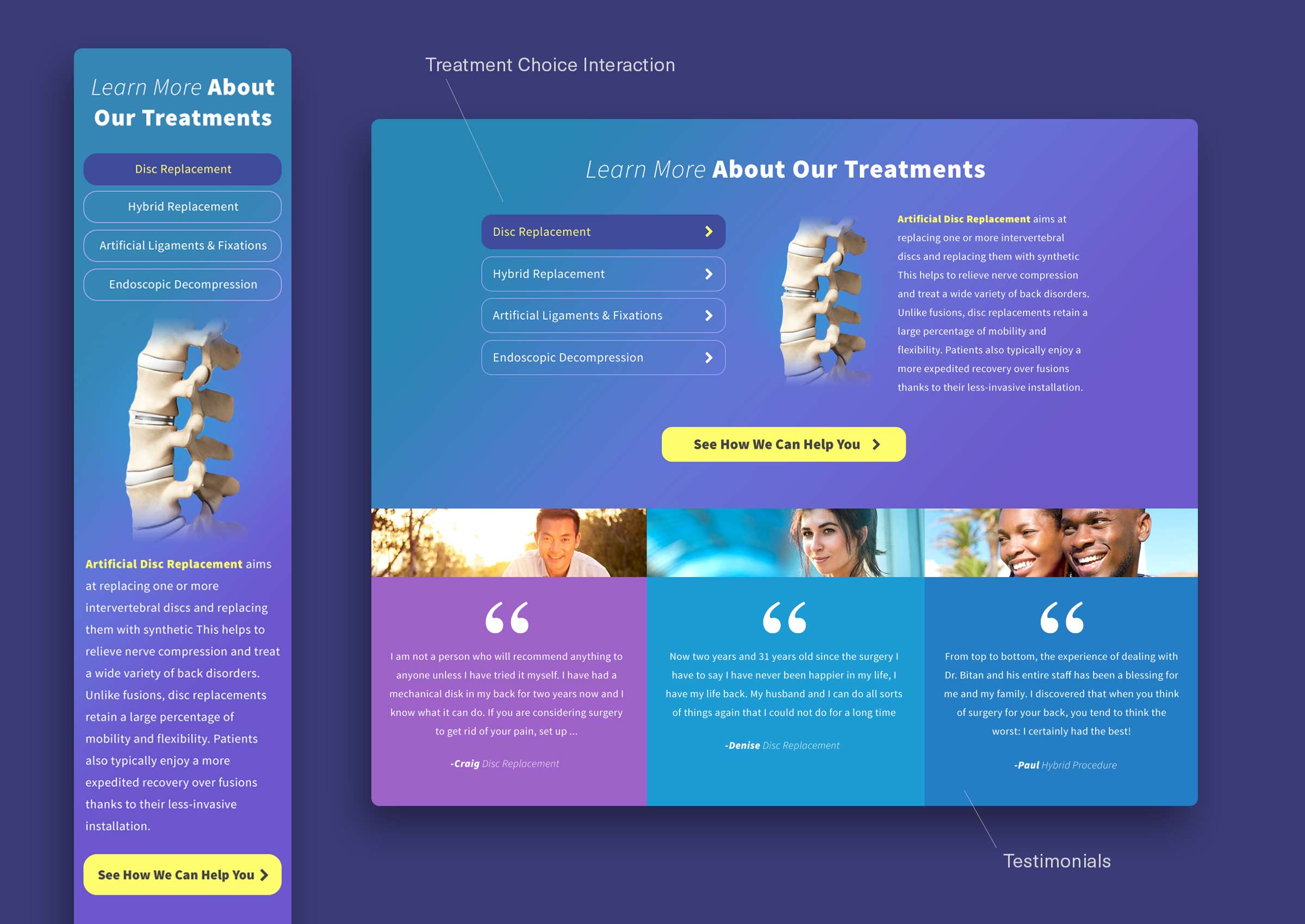
Subpages